On light backgrounds
SVG · Transparent background
Our brand · Brand guide
Buying a car brings people together. Our identity makes that idea visible: clear, approachable and focused on what we share.
Explore brand assets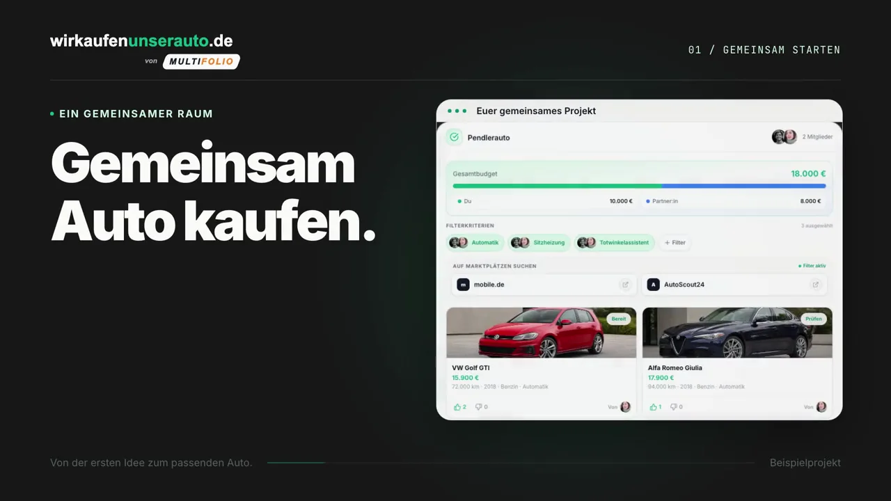
Our brand in motion
0:20 · Without sound
The film shows a shared car search, group decisions, the purchase and ongoing Car Management.
01 / BRAND GUIDE
Use the complete wordmark, including the multifolio signature. The green “unserauto” is the connecting element.
SVG · Transparent background
SVG · Transparent background
Keep at least the height of one wordmark letter clear on every side.
Scale proportionally. Keep the colors, lettering and signature together.
Use a calm background and the matching variant. The SVG uses Inter; install the font when editing.
02 / BRAND GUIDE
Two halves of a car, one green check: our icon represents a shared decision. These are the original assets used in the app and on the home screen.

 unserauto
The standalone mark used in the project navigation. Its transparent background lets it sit naturally alongside the wordmark.
PNG · 512 × 512 px
PNG Unser Auto
The icon for adding the website to an iPhone or iPad home screen. The white tile keeps the motif recognizable at small sizes.
PNG · 1254 × 1254 px
PNGKeep the blue and orange halves, the green check and the original proportions together. Use the transparent version in layouts and the white tile for the home screen.
03 / BRAND GUIDE
A focused palette: green for shared decisions, warm white for space and graphite for clarity.
fk-green
Logo, accents and selected states.
fk-green-dark
Hover states and strong accents.
fk-green-strong
Readable green text on light surfaces.
fk-green-light
Selected surfaces and subtle highlights.
fk-dark
Headlines, body text and dark surfaces.
fk-bg
Our primary page background.
fk-text-secondary
Supporting text and descriptions.
fk-border
Borders, separators and structure.
Use the darker green for small text on light backgrounds. Check contrast for every pairing; brand green works as an accent and with dark text.
The orange in the multifolio signature belongs to the co-brand: #F58220. The app icon illustration retains its original blue, orange and green tones.
04 / BRAND GUIDE
Inter is our primary typeface. JetBrains Mono gives numbers, codes and technical details a distinct place.
Decide together. Buy better.
Headlines get to the point. Body text leaves enough space to read and understand. The hierarchy stays simple.
View typeface(opens in a new tab)Details & data · Regular 400
Use sparingly for color values, identifiers and comparable numbers. Inter remains the voice of the interface.
View typeface(opens in a new tab)05 / Voice & attitude
We help people make decisions together. Our language is direct, understandable and calm. It gives people confidence and room to choose.
Address the group. Make shared goals visible.
“Find the car that fits your lives.”
Use everyday words and concrete next steps.
“Compare your favorites in one place.”
Explain what the product does and what a decision needs.
“Check whether sharing fits your daily routines.”
Write wirkaufenunserauto.de as one lowercase word, including the domain ending. Keep it unchanged in English, too.
Questions about using our brand?